When I first started at Pewter Graphics the company had an established logo, but was generally lacking in any kind of branding.
The brand had no direction and was muddled at best, and much of the marketing material and internal documents needed help.
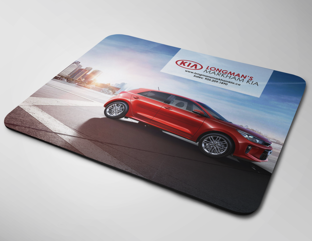
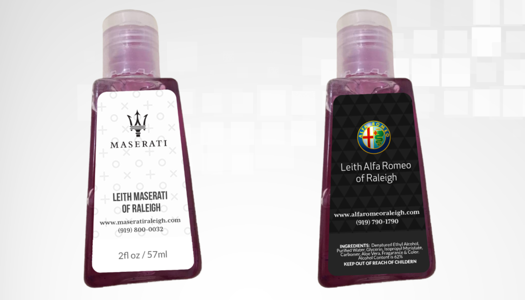
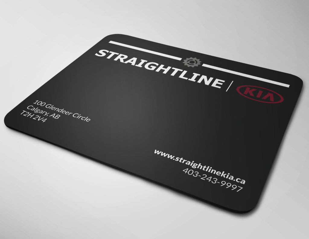
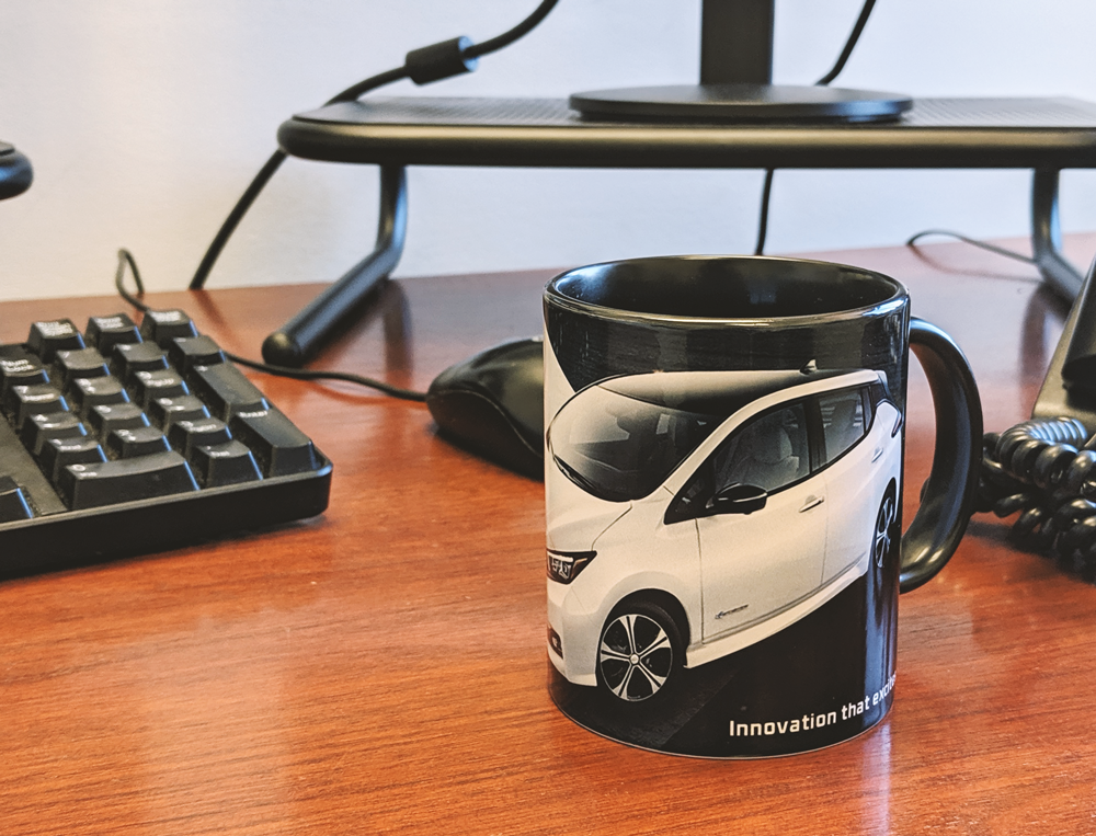
I also took over the role of designing all of the products that we custom make for our clients.
Scope
- Developing brand guidelines
- Revamping internal and external documents
- Setting up tracked weekly email marketing promotions
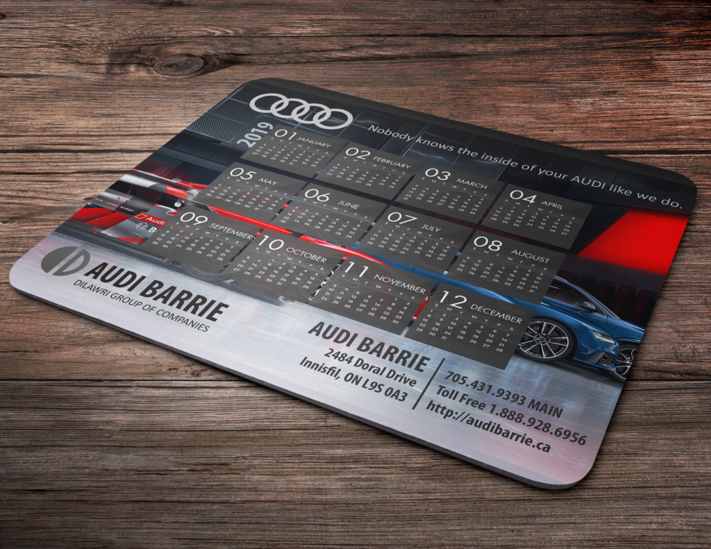
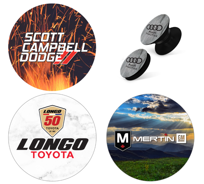
- Designing custom promotional products for Canadian and American car dealerships
- Product photography
1. The beginning
There was no consistency across flyers, email sendouts, or even the internal documents. The company had no brand guidelines set out, so each flyer that went out was a jumble of colors, fonts, and ideas. The internal documents used by the production team were thrown together and a mixture of copy-pasting from excel documents and inconsistent imagery & descriptions.
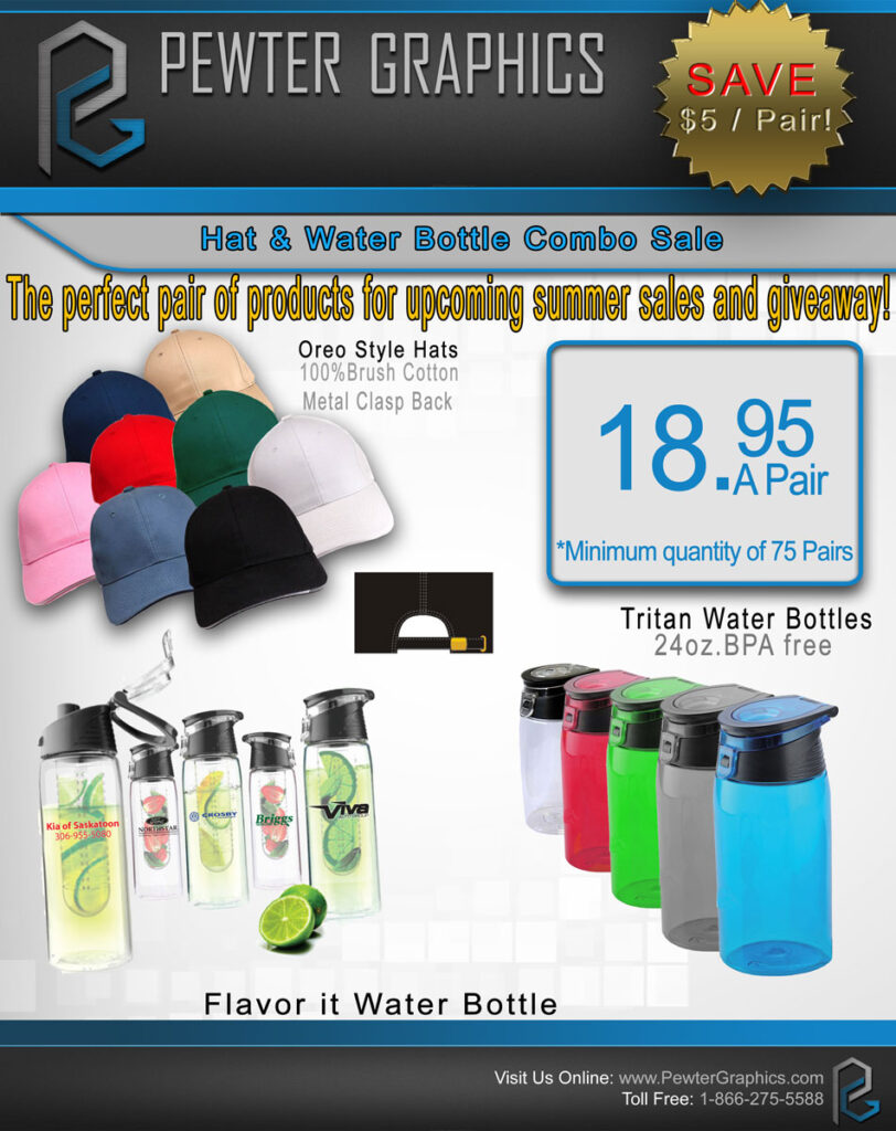
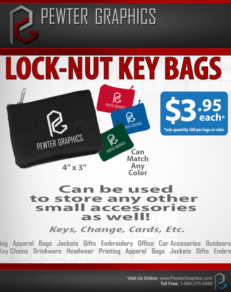
Some examples of old flyer designs:
2. Setting up brand guidelines
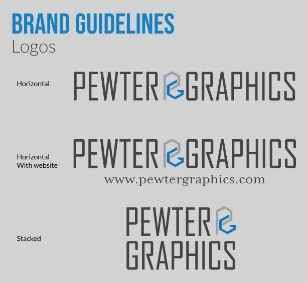
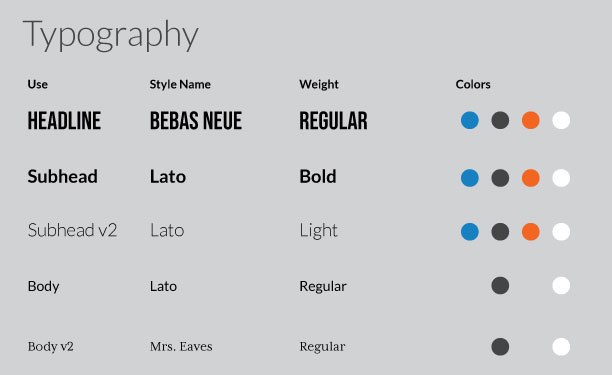
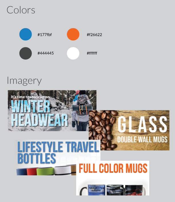
The first thing I wanted to accomplish was to develop a consistent brand strategy across all internal and external documents, so I worked with the owner to develop brand guidelines. He wanted to stick with the blue and orange that had been used on a semi-consistent basis in the past, and we chose a few fonts that worked well together so we could use them in any application. Once a branding guide was established, we were able to move on to revamping all internal and external assets.
3. Improving external document design
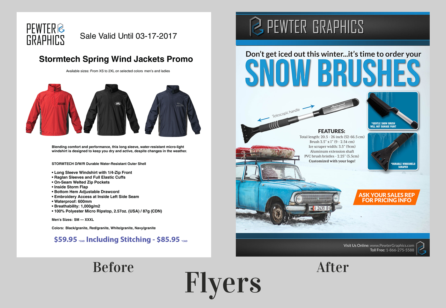
From here I developed some templates to use for both flyer and mockup design. A decent header and footer had come into use just before I started here, so we decided to keep that element but I wanted to improve the consistency of our designs – the previous designer had been changing not only the header and footer colors but also the colors of the actual logo with almost every flyer that was created. We were now able to use the new brand guidelines to streamline font and color use, which helped to develop consistent branding across all the flyers.
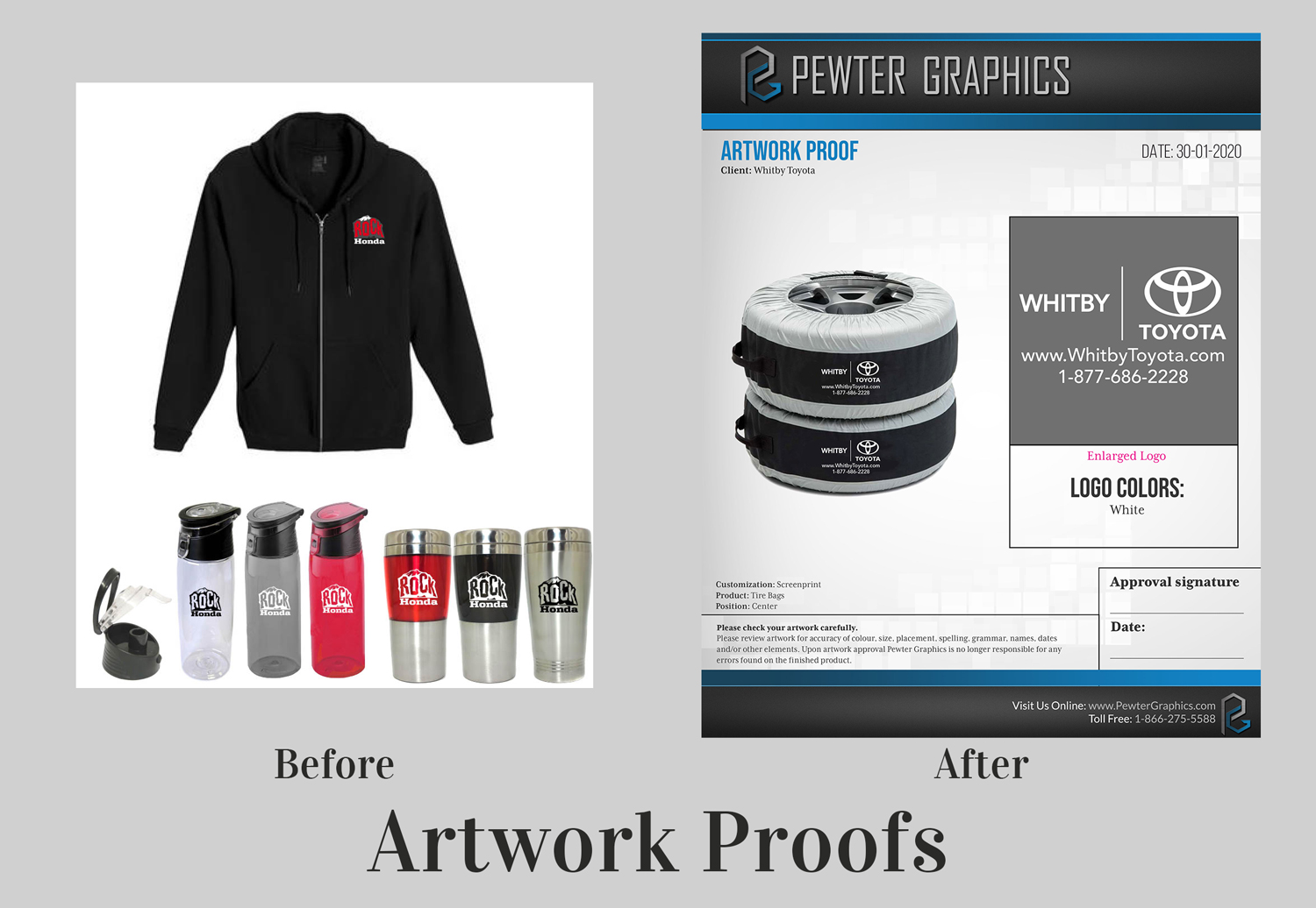
Another area that needed help was the mockups that were sent to clients for artwork approvals. The previous designer was simply dropping products onto blank white pages, popping a logo onto them and firing them off to clients. There was absolutely no Pewter Graphics branding on any of these documetns going out.
I developed a template for artwork proofs which included properly branded header/footers, an area for an enlarged version of the logo so that clients could proofread easily, a disclaimer, as well as a signoff area once the artwork was approved. The company had previously had a few issues with clients coming back saying they received products that were not what they requested, but now we had a system in place to have the customer take responsibility if a phone number was incorrect, or if the placement of a logo was centered instead of left aligned.
4. Improving internal document design
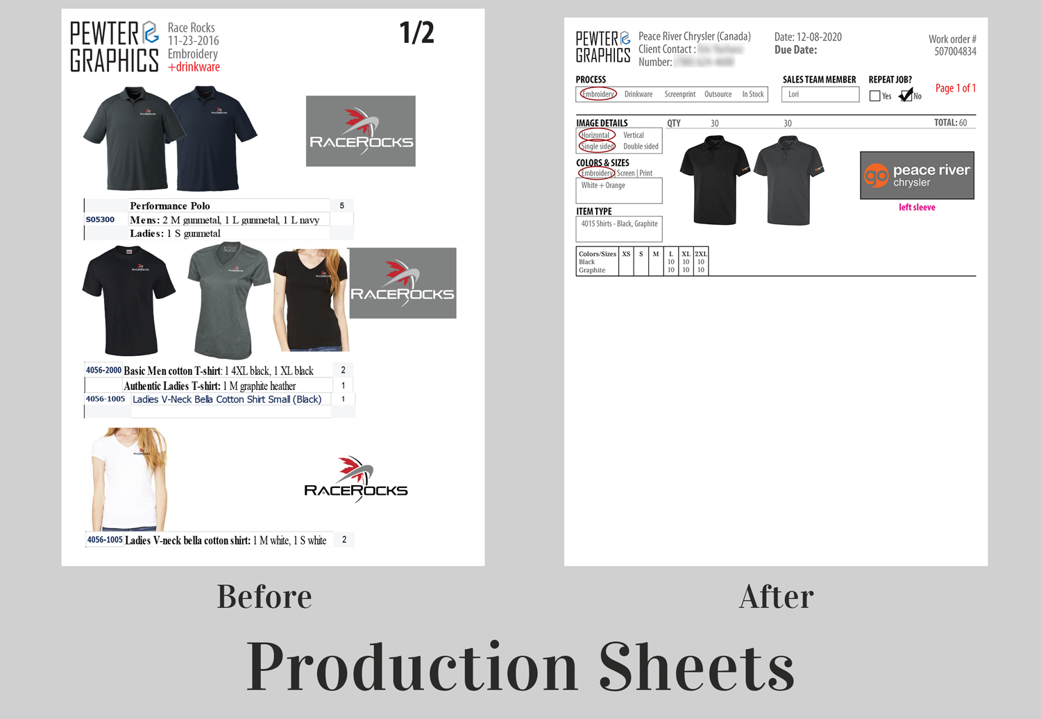
Internal documents were also a mess when I began working for Pewter Graphics. These documents are used by the production team to order products as well as to provide a visual for our embroidery and screenprinting teams. These documents were also sent to suppliers when we had to outsource products so it was essential they provided a cohesive overview of the job.
Starting out, these documents had very little information and the details they did include were presented in a new layout/format almost every time. I worked with the operations manager to develop a standardized “production sheet” which provided a complete overview of the job with information that would appear in the same place each time so if a screenprinter was looking for ink colors they would know exactly where to look.
5. Email marketing
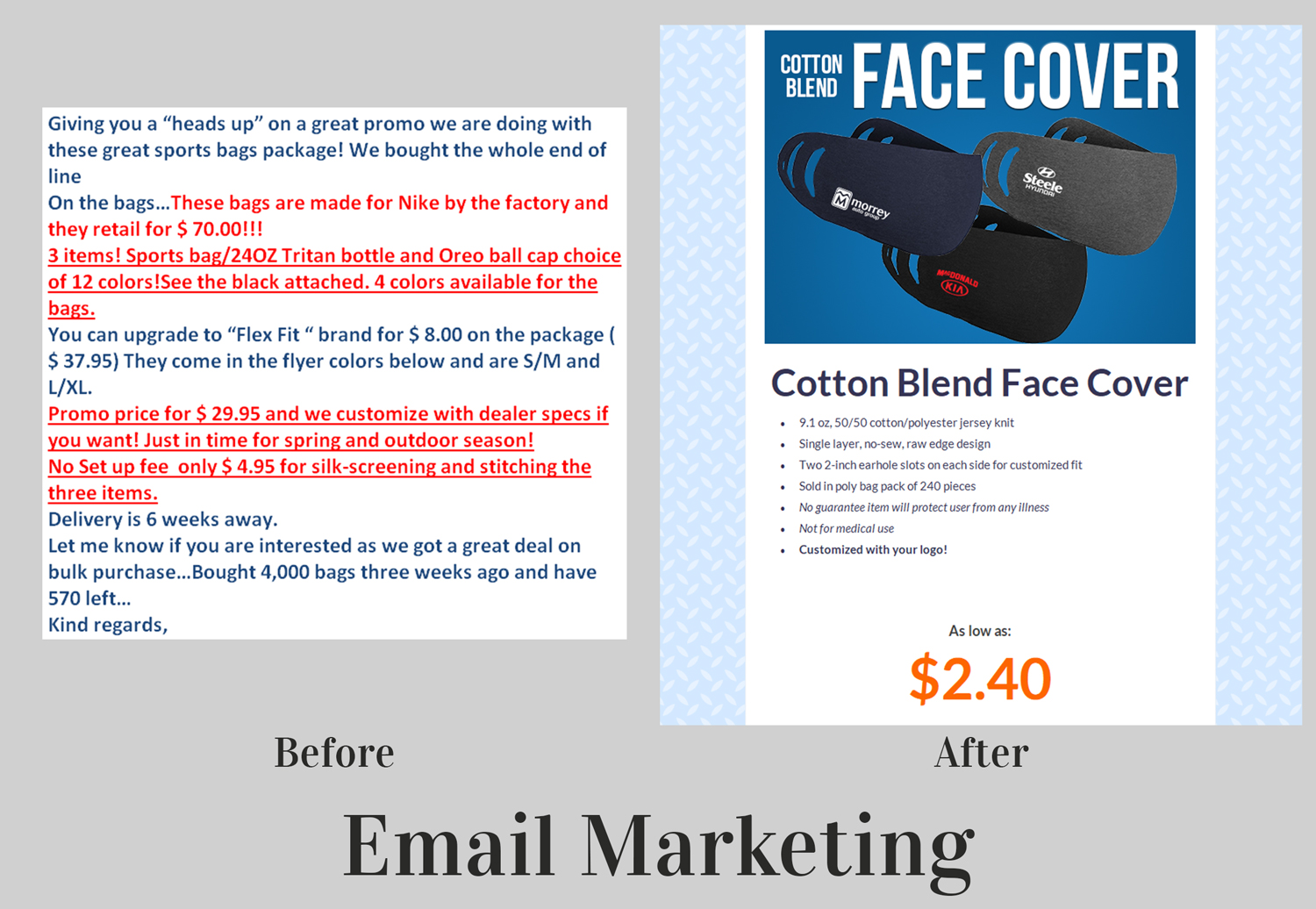
When I first began at Pewter, the administrative assistant would create a quick email blurb and send it to each of the sales team. From there, the sales team would draft their own emails using Microsoft Outlook and attach one of the corresponding product flyers to the email. They would send this email to all of their clients as a way of marketing deals each week. I moved them away from this strategy as the resulting marketing looked very unprofessional, and we had no idea if clients were even viewing the emails.
I took over the role of these weekly email merges and we moved to using SendInBlue and eventually Hubspot to send the weekly merges. This meant I could draft more unified looking marketing emails to send to our clients, create all the visuals myself so that the emails looked consistent, and this also introduced the ability for us to actually track our emails to see who was reading them. We were also able to start grouping customers by brands (we work mainly with car dealerships) so we could send out specials to say, only our Land Rover clients.
We were able to gather so much more information about which of our clients were engaging with our weekly sendouts and provide that information to the sales team so that they could target those clients with their sales calls.
Another improvement I implimented to these weekly sendouts was pre-planning which products to feature each week so that we had a 4 to 6 month marketing plan. Previously the owner decided, basically the day of the sendout, which products to send. This meant we were sometimes missing opportunities for themed sendouts such as cowboy hats for the calgary stampede, or breast cancer awareness hats. We need to be taking orders for these at least 2 months in advance so if we missed the sendout date we were not taking advantage of these booster events.
6. Product photography
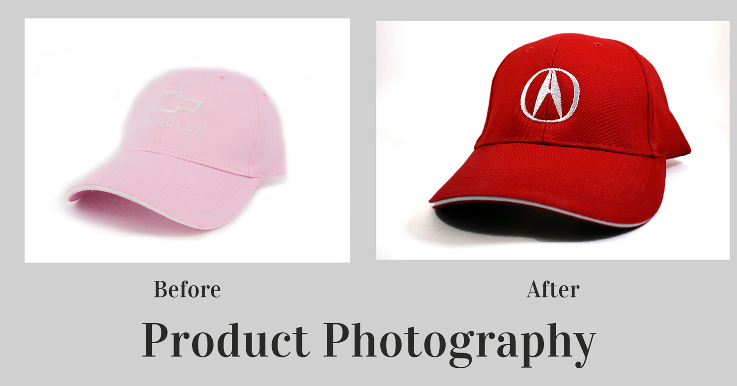
I was also able to impliment a policy of taking professional product photography of our finished products before they were shipped out to clients. This was useful to provide actual examples of work we have done (versus mockups) but also to have a record of what a product looked like before shipping out to the clients.
I also began taking proper photos of a large portion of our product library. We had previously been working with poorly taken photos of our products, or photos that our suppliers had sent us.
It’s a lot easier to sell a product when we have high quality, well lit photos of the products we sell vs 300px images that have been compressed who knows how many times. It also meant I had higher quality photos to work with when creating our email sendouts and marketing flyers.
Overview
It has been a pleasure working for an established company with a struggling brand identity. We have been able to create a cohesive brand image to portray a much more sleek and professional image to our clients.
